Category: UI/UX

  • Understanding UX Design

    Understanding UX Design

    Understanding UX Design with a Simple House Example

    When we learn UX design, one of the easiest ways to understand the process is by comparing it to building a house. Just like constructing a house step-by-step, UX design also follows a clear flow. Let’s break it down in a simple way.

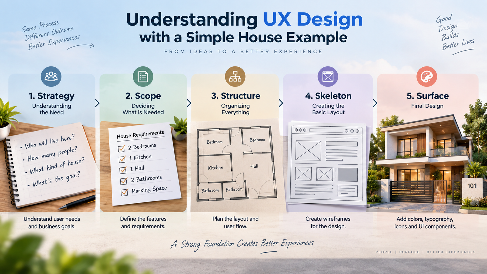
    1. Strategy – Understanding the Need

    First, imagine someone wants to build a house. Before doing anything, we ask them questions.

    Who will live in the house?

    How many people are there?

    What kind of house do they expect?

    This is the planning stage.

    In UX design, this is called Strategy. Here we try to understand user needs and business goals. We ask questions like:

    • What problem are we solving?
    • Who are the users?
    • What does the business want to achieve?

    So Strategy is basically understanding the goal before starting the design.

    2. Scope – Deciding What is Needed

    After understanding the need, the next step is deciding what things the house should have.

    For example:

    • 2 bedrooms
    • 1 kitchen
    • 1 hall
    • 2 bathrooms
    • Parking space

    This step is about listing all the requirements.

    In UX design, this stage is called Scope.

    Here we define features and requirements of the product.

    Example:

    • Login system
    • Order page
    • Payment option
    • Profile page

    So Scope means what all features the product will include.

    3. Structure – Organizing Everything

    Now we know what rooms are needed. Next, we decide how everything should be arranged.

    For example:

    • Hall in the front
    • Kitchen near the dining area
    • Bedrooms on the side
    • Bathroom attached to bedroom

    This is about planning the layout of the house.

    In UX design, this stage is called Structure.

    Here we create Information Architecture.

    This means deciding:

    • Which page comes first
    • How users move between screens
    • How the app or website flow works

    Basically, this step defines how users navigate the product.

    4. Skeleton – Creating the Basic Layout

    After planning the structure, we draw a basic blueprint of the house.

    It shows:

    • Where the walls are
    • Where doors and windows go
    • How big each room is

    But it doesn’t show colors or decorations yet.

    In UX design, this stage is called Skeleton.

    Here we create Wireframes.

    Wireframes show:

    • Where buttons are placed
    • Where images will appear
    • Where text content goes

    It’s like the basic layout of the design without styling.

    5. Surface – Final Design

    Finally, after everything is ready, we finish the house.

    We add:

    • Paint colors
    • Tiles
    • Furniture
    • Lighting
    • Decorations

    Now the house looks complete, and we hand over the key to the owner.

    In UX design, this stage is called Surface.

    Here we add:

    • Colors
    • Typography
    • Icons
    • Images
    • UI components

    This becomes the final visual design and prototype that users will interact with.

    Conclusion

    UX design is not just about making things look good. It is a step-by-step process:

    Strategy → Understand the problem

    Scope → Decide the features

    Structure → Plan the flow

    Skeleton → Create wireframes

    Surface → Design the final UI

    Just like building a house, if the foundation and planning are strong, the final product will be much better for the people who use it.
  • UI Login Animation

    UI Login Animation

    How I Made a Simple but Beautiful Login Screen Animation in Figma

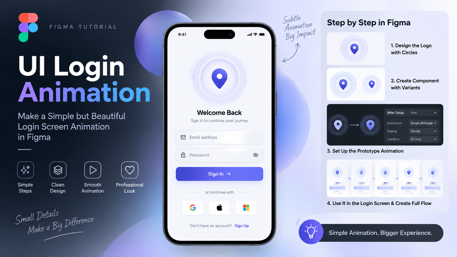
    I was working on a login screen recently. Nothing too fancy — just a clean, simple screen with a logo in the center. But I wanted that logo to feel alive. So I added a blinking animation around it using Figma’s prototyping tools. Here’s exactly how I did it, step by step.


    The Idea

    My app logo looks like a location icon — you know, that pin drop shape. I wanted to put two circles behind it that blink in and out, like a pulse. The kind of animation you see on maps when your location is loading. It looks simple, but it makes the whole screen feel premium.


    Step 1 — Design the Logo with Circles

    First, I placed the logo in the center of my login screen frame.

    Then I created two circles around it. One large, one small. Both sit behind the logo. The small one is tight around the logo. The large one is wider, like a ripple. I used low opacity on both — something like 20% to 30% — so they don’t overpower the logo. They just sit there quietly in the background.

    This gives the logo a nice layered look even before any animation starts.


    Step 2 — Make It a Component

    I selected everything — the logo, both circles, the whole group — and created a Frame out of it. Then I selected that frame and created a Component (Cmd/Ctrl + Alt + K).

    This is important. You need it to be a Component because we are going to make variants of it. Variants are just different states of the same component — like “circles visible” and “circles hidden.”

    Once the component is ready, I went into the Component and created a second variant. In the first variant, the circles are visible. In the second variant, I reduced the circle size to very small — almost nothing — and kept the opacity at zero. This is the “off” state.


    Step 3 — Set Up the Prototype Animation

    Now the fun part.

    I opened the Prototype panel. I connected Variant 1 to Variant 2 using the interaction trigger: After Delay. I set the delay to 1ms — basically instant. Then for the animation, I chose Smart Animate with Gentle easing and 800ms duration.

    Then I connected Variant 2 back to Variant 1 — same settings. After Delay, 1ms, Smart Animate, Gentle, 800ms.

    This creates a loop. The circles grow and shrink. Grow and shrink. That’s your pulse animation.


    Step 4 — Use It in the Login Screen

    I copied the component and pasted it into my main Login Screen frame. When you preview it in prototype mode, you will see the blinking animation working right there on the screen.

    The login screen itself stays simple — just the animated logo in the center, an email field, a password field, and a button below. But that small animation on the logo makes the whole screen feel polished.


    Step 5 — Duplicate Frames for the Full Flow

    To show the full animation in a prototype presentation, I copied the login frame five times and connected them in sequence. Each frame shows the next state. With After Delay and Smart Animate, Figma smoothly transitions between them, so it looks like one continuous loop.


    Why This Works

    The animation is subtle. It does not distract the user. It just adds life to an otherwise static screen. The Gentle easing makes the circles grow and shrink in a smooth, natural way — not robotic, not bouncy. Just calm and clean.

    800ms is the right speed for this. Slower feels sluggish. Faster feels nervous. 800ms hits that sweet spot where it feels like a natural breath.


    Quick Summary

    • Logo sits in the center of the login screen
    • Two circles behind the logo — one large, one small
    • Group everything into a Frame, then make it a Component
    • Create two Variants — circles visible and circles hidden
    • Connect them with After Delay (1ms) + Smart Animate + Gentle + 800ms
    • Loop it back and paste into your login screen
    • Preview in Prototype mode to see the blink effect

  • Parallax Scroll Animation in Figma

    Parallax Scroll Animation in Figma

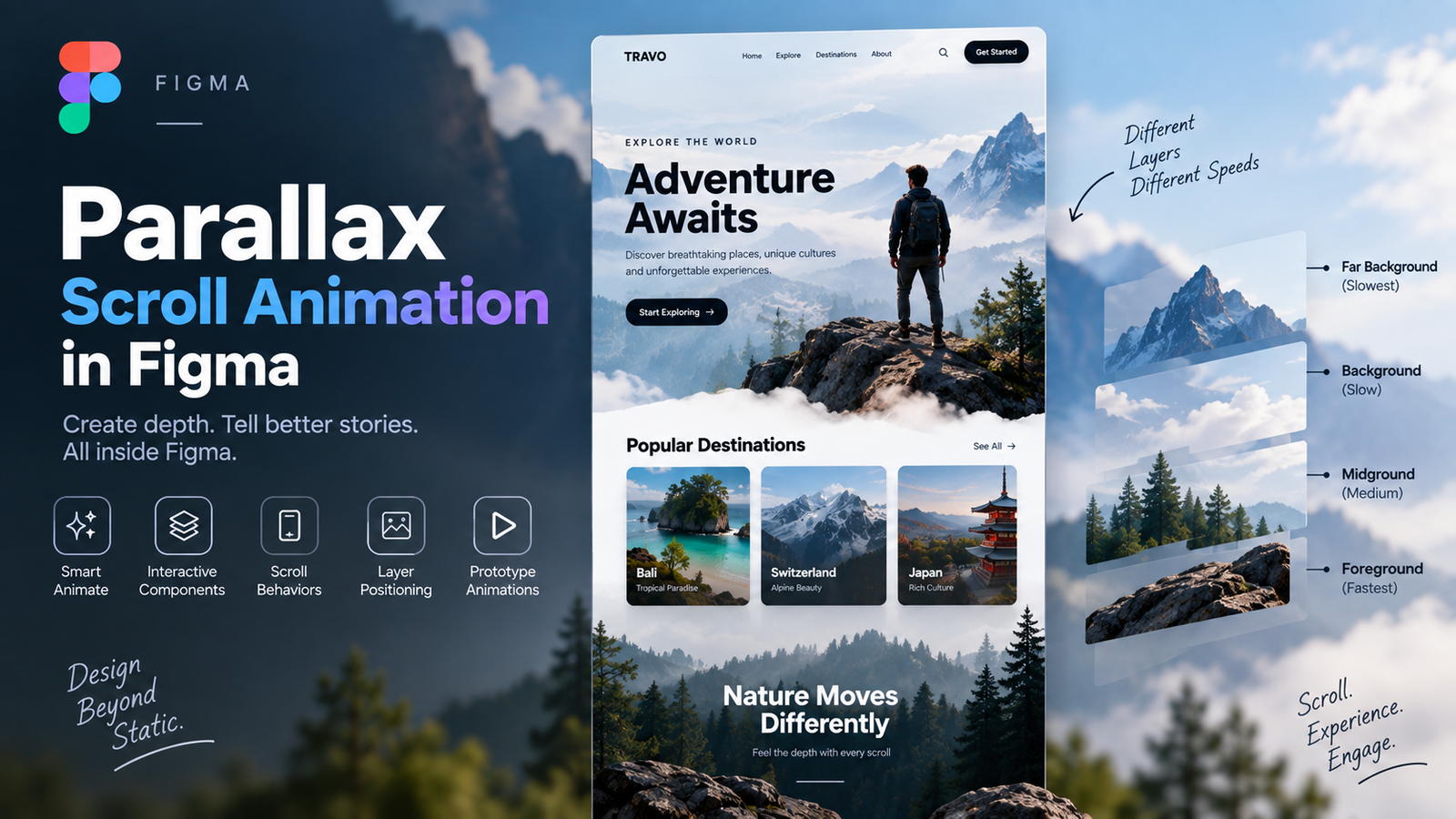
    Parallax Scroll Animation is a technique where different elements move at different speeds while scrolling, creating a sense of depth and a more engaging user experience.

    In Figma, you can create parallax effects using:

    • Smart Animate
    • Interactive Components
    • Scroll Behaviors
    • Layer Positioning
    • Prototype Animations

    This technique can be used to animate:

    • Images
    • Text
    • Cards
    • Backgrounds
    • Icons
    • Landing Pages
    • Mobile App Screens

    By combining these features, you can create smooth, modern, and visually appealing prototype animations directly in Figma without writing code.

  • How to Choose a Color Palette That Reflects Brand Identity

    How to Choose a Color Palette That Reflects Brand Identity

    Every designer hits this wall at some point. You open Figma, create a new frame, and then just stare at it wondering what color the app should even be. Should it be blue because everyone trusts blue? Should it be bold and loud to stand out? Should it match the logo exactly, or is that too literal?

    I have been through this exact confusion multiple times while building design systems for real products, and honestly, the answer is not “pick your favorite color.” A color palette is not decoration. It is a communication tool. Before a user reads a single word on your screen, the color has already told them something about your brand — whether it is playful, serious, premium, affordable, calm, or energetic. That is a huge responsibility for something that seems as simple as choosing a hex code.

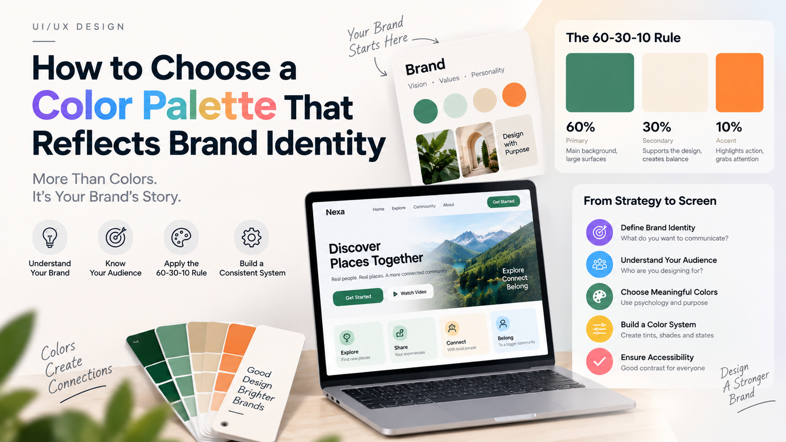
    So let’s talk about a framework that actually makes this process less random: the 60-30-10 rule.

    What is the 60-30-10 Rule

    This rule originally comes from interior design, believe it or not. Designers used it to decorate rooms so that the color balance never feels overwhelming or boring. The same logic works beautifully for digital products.

    Here is how it breaks down:

    60% – Dominant Color
    This is the color that covers most of your screen. Backgrounds, large surfaces, containers — basically the color your user sees the most without even noticing it. It sets the overall mood of the app. If this color is wrong, the whole app feels off, even if every other detail is perfect.

    30% – Secondary Color
    This supports the dominant color. Think of navigation bars, cards, section dividers, or secondary buttons. It creates depth and separates different areas of the interface without fighting for attention.

    10% – Accent Color
    This is the color that gets things done. Call-to-action buttons, links, notifications, highlights — anything that needs the user’s eyes immediately. Because it is used sparingly, it stays powerful. If you use your accent color everywhere, it stops being an accent and just becomes noise.

    The beauty of this rule is balance. Nothing competes for attention, and every color has a clear job.

    Connecting Color to Brand Identity

    Choosing colors based on a ratio is only half the job. The real question is: what should those colors actually be, and why?

    This is where a lot of designers go wrong. They pick trendy colors instead of meaningful ones. Before opening a color picker, I always ask three questions:

    1. What emotion should the brand trigger?
    A fintech app wants to feel trustworthy and stable, so cooler tones like blue or deep green often work well. A food delivery app wants to feel appetizing and energetic, so warm tones like orange or red show up a lot. A wellness app wants calmness, so soft greens, sage, or muted tones are common. Color psychology is not exact science, but it is a strong starting signal.

    2. Who is the target user?
    A palette that works for Gen Z users may feel too loud for a professional B2B audience. A palette built for a premium product needs restraint — often fewer colors, more whitespace, and muted tones rather than bright saturated ones.

    3. What does the product actually do?
    This one gets ignored a lot. A city discovery app, for example, needs colors that reflect the energy and locality of a real place, not a generic tech-startup blue. A healthcare app needs colors that feel safe and clinical, not experimental.

    Once you have answers to these three questions, your dominant, secondary, and accent colors should naturally follow that emotional direction — not the other way around.

    Building the Actual Palette

    Here is a simple workflow that works well in practice:

    1. Pick your dominant color first. This becomes your brand’s backbone. Everything else is built to support it.
    2. Choose a secondary color that complements, not competes. Analogous colors (colors next to each other on the color wheel) usually blend smoothly. If you want more contrast, complementary colors work, but use them carefully.
    3. Save the boldest, brightest color for your accent. This should be the color users associate with action. It needs enough contrast against your dominant color to be instantly visible.
    4. Create tints and shades of each color. A single flat color is not enough for a real product. You need lighter tints for backgrounds, hover states, and disabled states, plus darker shades for text and emphasis. This is basically how design systems create their color scale, like a 50 to 900 range designers commonly use.
    5. Check contrast for accessibility. No matter how good a palette looks, if the text is unreadable against the background, the whole thing fails. Always test contrast ratios before finalizing anything.

    A Quick Example

    Imagine you are designing an app for a local community platform. The dominant color could be a deep, grounded tone like forest green, because it reflects trust and locality. The secondary color could be a warm cream or off-white, giving it a human, approachable feel instead of a cold corporate one. The accent color could be a bright green, used only for buttons and key actions, so users always know exactly where to tap next.

    Notice how none of these choices were random. Each one supports a feeling the brand wants to create.

    Final Thought

    A color palette is not something you finalize in five minutes by browsing Pinterest. It is a decision that should be backed by ratio, psychology, and purpose. The 60-30-10 rule gives you the structure, but the meaning behind each color is what actually turns a palette into a brand identity.

    Next time you are stuck choosing colors, do not start with “what looks nice.” Start with “what should this brand feel like.” The right palette will follow naturally after that.

  • 4 Foundational UI Design Principle (C.R.A.P)

    4 Foundational UI Design Principle (C.R.A.P)

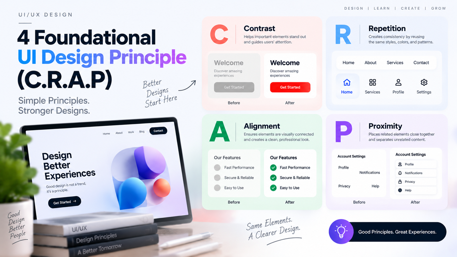
    C.R.A.P is a popular design principle framework that helps designers create clean, organized, and visually effective interfaces.

    C – Contrast

    Contrast helps important elements stand out from others. By using different colors, sizes, shapes, or typography, designers can guide users’ attention to key content and actions.

    R – Repetition

    Repetition creates consistency throughout a design. Reusing the same colors, fonts, buttons, icons, and spacing patterns helps users understand and navigate the interface more easily.

    A – Alignment

    Alignment ensures that every element has a visual connection with other elements. Proper alignment creates structure, improves readability, and makes the design look professional and organized.

    P – Proximity

    Proximity means placing related elements close together and separating unrelated elements. This helps users quickly understand relationships between content and improves overall usability.

    Summary

    C.R.A.P = Contrast + Repetition + Alignment + Proximity

  • What VJ Siddhu’s Mottai Maadi Party Taught Me About UX Design

    What VJ Siddhu’s Mottai Maadi Party Taught Me About UX Design

    Most celebrity interview apps and platforms feel the same. A hero sits across a host. Lights, camera, set design. The host asks about their next movie. The hero gives a polished answer. Then it ends.

    You watched it. But you felt nothing.

    Now compare that to Mottai Maadi Party.

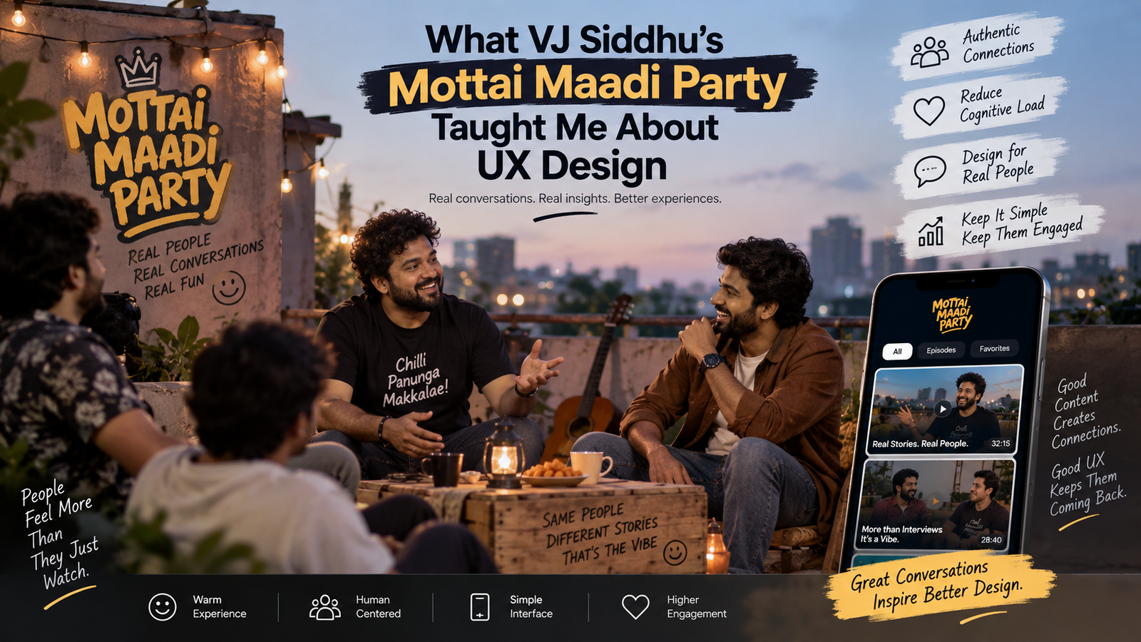
    Same hero. No studio. No formal set. Just a rooftop, some people sitting around, and honest conversation. And suddenly you’re laughing, you’re curious, you actually feel like you know this person.

    That difference — that shift in how you feel — is exactly what good UX is about.


    The Problem With Traditional Celebrity Content

    Traditional celebrity interviews are built for broadcast. They are designed to be watched once and forgotten. The format is rigid. The hero is in “public mode.” They talk about their film, maybe say something funny for the camera, and leave.

    People watch but they don’t connect.

    As a UX designer, when I saw this pattern I thought — this is the same problem we have in so many apps. The interface looks professional. Everything is technically correct. But the person using it feels nothing. They complete the task and close the app.

    There is no moment where they think — I want to stay here longer.


    What Mottai Maadi Party Gets Right

    VJ Siddhu’s format does something very smart. He removes the pressure from both sides.

    The hero is not being interviewed. They are just hanging out. The questions are casual. The setting is informal. People laugh naturally. They say things they would never say in a broadcast interview. You see a version of them that feels real.

    From a UX lens, this is what we call reducing cognitive load and creating psychological safety. When the environment feels low-pressure, people behave naturally. And natural behavior is what keeps people engaged.

    The design of the experience — a rooftop, plastic chairs, chai maybe — all of it signals: this is not formal. You can relax. And that signal makes everything that follows feel more honest and more enjoyable.


    The UX Principle Behind It

    There is a concept in UX called ambient intimacy. It means making a person feel close to something or someone without forcing that closeness. You are not told to feel connected. The environment just creates the conditions for it.

    Mottai Maadi Party does this perfectly. The hero is sitting the same way you sit at home. There is no elevated stage. No dramatic lighting. No rehearsed answers. Everything about the visual and conversational environment says — we are equals here.

    When you apply this to app design, it means: stop designing experiences that feel like a report. Design experiences that feel like a conversation.


    How This Applies to App Design

    If you were building an app around this kind of celebrity content — where heroes talk honestly, informally, in a way people actually enjoy — the design has to match the content.

    Here is what that looks like in practice.

    The colors should be warm and easy on the eyes. Not aggressive, not overly branded. Think muted tones, off-whites, earthy shades. Colors that feel like a relaxed afternoon, not a press release.

    The typography should be simple and readable. One clean font. Nothing decorative. The content is the hero — literally — so the design should not compete with it.

    The layout should feel like you are scrolling through a conversation, not a catalogue. Cards that feel light. Thumbnails that feel candid, not staged. If the thumbnail looks too polished, people already expect a formal interview and prepare to be bored.

    Navigation should be minimal. The person came to watch and feel something. Do not interrupt them with pop-ups, banners, or too many options. One tap to play. One tap to share. That is enough.

    The app should keep them inside. Every design decision — autoplay, related content placement, how the next video appears — should feel like a natural flow, not a push notification strategy.


    The Bigger Lesson

    The reason Mottai Maadi Party works is because the format respects the audience. It does not talk down to them. It does not put celebrities on a pedestal. It says — these people are human, come see.

    Good UX works the same way. It respects the user. It does not shout at them with colors and buttons. It does not make them feel like they are using software. It makes them feel like they are in the right place.

    Simple design. Warm feel. Easy to use. Keeps people coming back.

    That is the whole thing. VJ Siddhu figured it out for content. We just need to figure it out for the screen.


    The best designs, like the best conversations, make you forget you are in a designed space at all.

  • Usability & Accessibility

    Usability & Accessibility

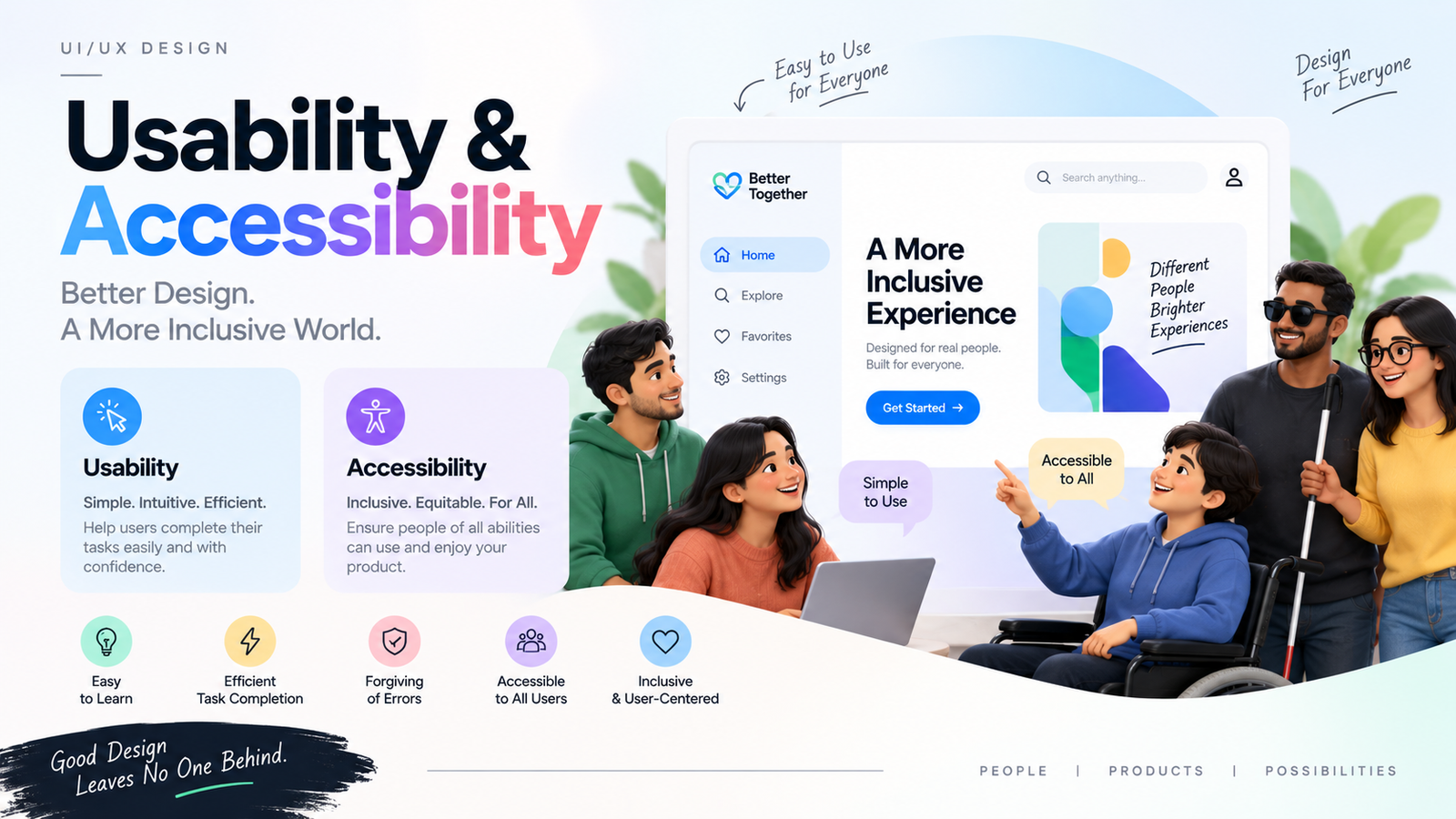
    Usability and Accessibility are essential aspects of UI/UX design that ensure a product is easy to use and accessible to everyone.

    Usability

    Usability focuses on creating interfaces that are simple, intuitive, and efficient. Users should be able to complete their tasks quickly, understand how the interface works, and recover easily from mistakes without frustration.

    Accessibility

    Accessibility ensures that people of all abilities, including those with visual, hearing, motor, or cognitive impairments, can use the product effectively. This includes proper color contrast, readable text, keyboard navigation, screen reader support, and clear interactive elements.

    Why It Matters

    A successful design should be:

    • Easy to learn and use
    • Efficient for completing tasks
    • Forgiving of user errors
    • Accessible to all users
    • Inclusive and user-centered

    By prioritizing usability and accessibility, designers create products that provide a better experience for everyone, regardless of their abilities or circumstances.

  • The Airplane Door Principle: What Aviation Safety Teaches Us About UX

    The Airplane Door Principle: What Aviation Safety Teaches Us About UX

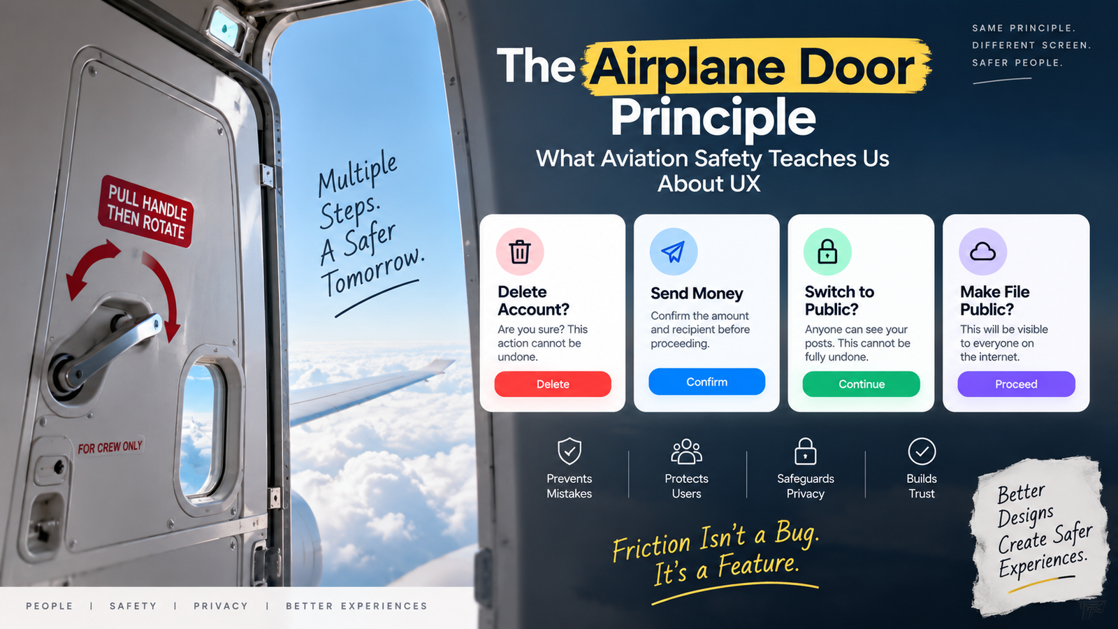
    Have you ever noticed how hard it is to open an airplane door mid-flight? Not because someone locked it with a key, but because of how the door itself is designed. This one small detail is actually one of the smartest examples of UX (User Experience) design you’ll ever come across — and it has a lot to teach app and web designers about safety and privacy.

    How a Normal Door Works

    Think about the door in your house. You push it, or pull it, and it opens. Simple. One action, one result. That’s how most doors work, and that’s how most UI elements work too — you tap a button, something happens immediately.

    How an Airplane Door Works

    Now compare that to an airplane door. It’s a completely different story.

    An airplane door is what’s called a “plug door.” To close it, you don’t just push it shut like a normal door. You push it into the frame, and then there’s a handle you need to pull down or rotate. Only after that handle is engaged does the door actually lock into place and seal properly. There’s no single “close and you’re done” action. It’s a two-step, sometimes three-step process, and each step needs a deliberate, physical action from the person operating it.

    Why so complicated? Because the cost of getting it wrong is enormous. At cruising altitude, the air pressure inside the cabin is much higher than the air pressure outside. If that door isn’t sealed correctly, you’re not just dealing with an inconvenience — you’re dealing with a life-threatening situation. So the design forces multiple deliberate steps before the “dangerous” state (door closed and sealed) is reached. You literally cannot open that door accidentally, and you cannot close it carelessly either.

    This is not bad UX. This is UX doing exactly its job — making the safe path easy and the risky path require intention.

    The Real Lesson: Friction Is a Feature, Not a Bug

    In most of our design training, we’re taught to reduce friction. Fewer clicks, fewer steps, faster checkout, one-tap actions. And for 90% of what we design, that’s the right call. Nobody wants five confirmation screens to like a photo.

    But there’s a category of actions where friction isn’t the enemy — it’s protection. The airplane door teaches us this exact principle: when the consequence of an action is serious, irreversible, or dangerous, the design should slow the person down, not speed them up.

    Where We Already See This in Apps

    Once you start noticing this pattern, you’ll see it everywhere in good product design.

    Deleting your account. Most serious apps don’t just show a “Delete Account” button that works with one tap. Instead, they ask you to type “DELETE” in a text box, or re-enter your password, or wait for a confirmation email. That’s the digital version of the airplane door handle — an extra deliberate step standing between you and something you can’t undo.

    Sending money. UPI apps and banking apps almost always show a confirmation screen with the amount, the recipient’s name, and sometimes even ask for a PIN or biometric scan right before the transfer goes through. One accidental tap sending money to the wrong person could be a real financial loss, so the app adds friction exactly at that final moment.

    Switching a private account to public. Instagram, for example, doesn’t just flip your account from private to public with one toggle. It usually shows a warning explaining what will change — anyone can see your posts, your follower list becomes visible, and so on. This matters because privacy, once broken, can’t really be undone. Someone could screenshot your photos within seconds of your account going public. So the app makes sure you understand what you’re agreeing to before you agree to it.

    Leaving or deleting a WhatsApp group. Even something as small as leaving a group shows a confirmation message. It seems minor, but for some people, that action has social consequences they didn’t intend.

    Cloud storage permissions. When developers set an AWS S3 bucket or a Google Drive folder to “public,” most platforms now show a clear red warning. This exists because “public” data has caused real data leaks in the past — company data, personal photos, even government files have leaked because someone clicked “public” without realizing the impact.

    Why This Matters for Privacy and Security Specifically

    You mentioned something important — the difference between something being private versus public, and why that switch needs extra care. This is exactly the airplane door principle applied to data.

    A “private” setting is like the airplane door closed and sealed — safe, contained, protected. A “public” setting is like opening that door mid-flight — once it’s open, you can’t control what happens next. The UX design of that switch should reflect how serious the consequence is. That means:

    • Clear labeling, not vague icons alone
    • A confirmation step for high-impact changes
    • Sometimes a short explanation of what changes for the user
    • No dark patterns that make “public” the easy default and “private” the hidden option

    The Takeaway for Designers

    Not every action deserves friction. But every irreversible, sensitive, or safety-related action deserves a moment of pause built into the design. The airplane door isn’t inconvenient — it’s honest about how serious the moment is. Good UX does the same thing: it matches the difficulty of the action to the weight of its consequence.

    Next time you’re designing a delete button, a public/private toggle, or a payment confirmation, ask yourself one question: would an airplane door designer be okay with this being just one click?

    If the answer is no, add the handle.

  • 5 Core Principles of UI Design

    5 Core Principles of UI Design

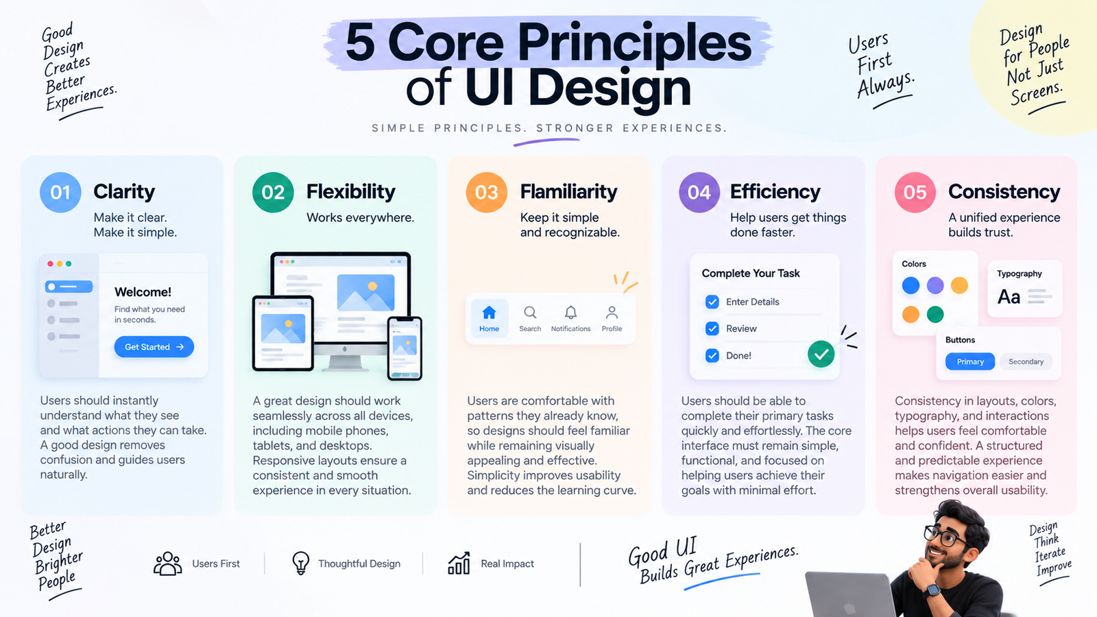
    1. Clarity

    Users should instantly understand what they see and what actions they can take. Analyze existing designs, compare different approaches, and create interfaces that are clear, intuitive, and easy to navigate. A good design removes confusion and guides users naturally.

    2. Flexibility

    A great design should work seamlessly across all devices, including mobile phones, tablets, and desktops. Responsive layouts and well-planned wireframes ensure a consistent and smooth experience in every situation.

    3. Familiarity

    Keep the interface simple and recognizable. Users are comfortable with patterns they already know, so designs should feel familiar while remaining visually appealing and effective. Simplicity improves usability and reduces the learning curve.

    4. Efficiency

    Users should be able to complete their primary tasks quickly and effortlessly. While powerful features are important, the core interface must remain simple, functional, and focused on helping users achieve their goals with minimal effort.

    5. Consistency

    Consistency in layouts, colors, typography, and interactions helps users feel comfortable and confident. A structured and predictable experience makes navigation easier and strengthens the overall usability of the product.

  • What Tamil Cinema and YouTube Teach Us About UX Pacing

    What Tamil Cinema and YouTube Teach Us About UX Pacing

    If you have grown up watching Tamil cinema, you already understand pacing better than most UX textbooks teach it. Every mass entry, every interval block, every “second half” twist is a lesson in how to control attention over time. As a designer, once I started paying attention to why these moments work, I realized the same principles apply directly to how we structure screens, flows, and onboarding in digital products.

    This post breaks down what Tamil cinema and Tamil YouTube formats get right about pacing, and how those same ideas can make your app or website feel more engaging.

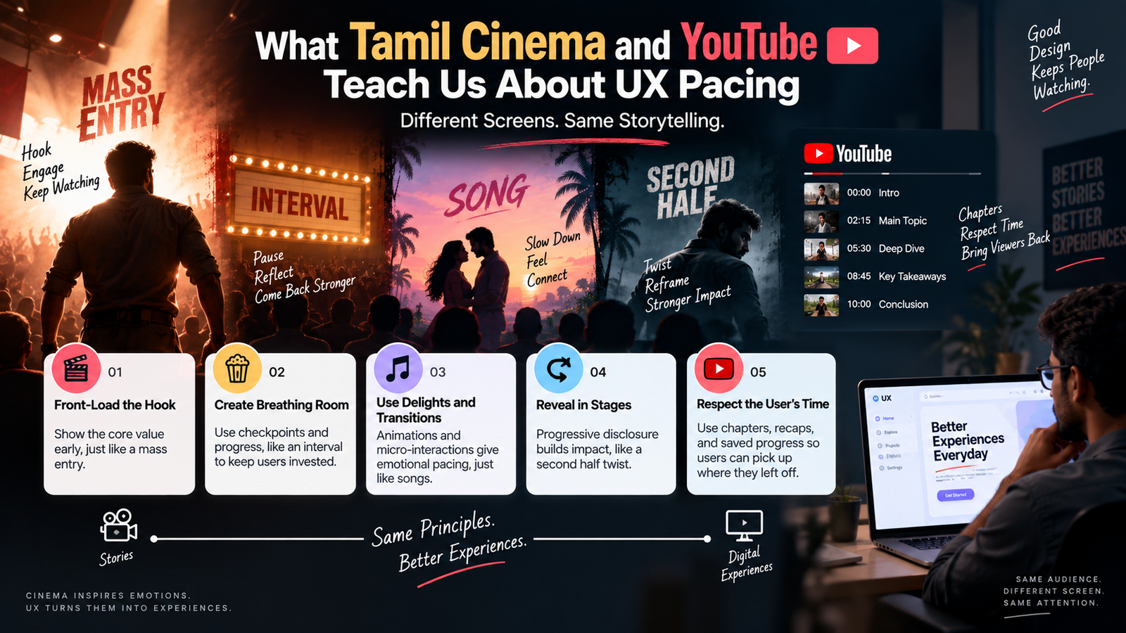
    The Mass Entry: Front-Loading the Hook

    Every Tamil film fan knows the feeling of a hero introduction scene. The camera holds, the music swells, and by the time the character actually appears, the audience is already leaning in. Directors don’t waste this moment on exposition — they front-load emotion and spectacle before any dialogue happens.

    In UX, this translates to the first five seconds of any experience. Whether it’s an app’s splash screen, an onboarding flow, or a landing page, users decide almost instantly whether something feels worth their time. Just like a director wouldn’t bury the hero entry in the middle of a boring scene, we shouldn’t bury our product’s core value inside a wall of text or a long signup form. Show the “hero moment” — the core benefit or the most delightful interaction — as early as possible.

    Tamil YouTube creators understand this even better than filmmakers because they don’t have the luxury of a captive theater audience. The first 5-10 seconds of a video has to hook the viewer before they swipe away. This is exactly why so many popular Tamil YouTube formats open with a quick preview of the most exciting moment before rewinding to the actual start. UX designers can borrow this trick directly — previewing an outcome (a finished report, a completed dashboard, a “before/after” state) before asking the user to do the work to get there.

    The Interval: Designed Breathing Room

    The interval in Tamil cinema isn’t just a bathroom break — it’s a structural device. Good films place the interval right after a major plot twist or emotional peak, so the audience carries that tension into the break and comes back invested in resolving it.

    In digital products, we rarely think about deliberate “breathing room,” but we should. Long forms, multi-step checkouts, and onboarding flows all benefit from interval-like checkpoints. A progress bar that shows “Step 3 of 5” is functionally similar to an interval — it tells the user where they are, gives them a natural pause point, and reassures them that the effort so far hasn’t been wasted. Apps that save user progress automatically are, in a sense, giving users a safe interval to walk away and return without losing their place.

    The mistake many products make is having no interval at all — a single unbroken form or flow that gives the user no sense of progress. This is the equivalent of a three-hour film with no interval; even if the content is good, the pacing exhausts people.

    Songs as Emotional Pacing, Not Filler

    A common criticism of older Tamil cinema is that songs “interrupt” the story. But well-placed songs actually serve a pacing function — they slow the emotional tempo after an intense scene, or they compress time (a “friendship song” showing months passing in three minutes).

    In UX, this maps to transitions and micro-interactions. A loading animation, a success screen, or a subtle confetti burst after completing a task isn’t just decoration — it’s pacing. It gives the user’s brain a moment to register that something happened before the next demand is placed on them. Skipping these moments and jumping straight from one dense screen to another creates the same fatigue as a film with no tonal variation — everything feels equally intense, so nothing feels important.

    This is actually close to the animation work I did on a login screen pulse effect — the pulse wasn’t just visual flair, it was pacing. It gave the user a half-second of reassurance between “I tapped login” and “I’m now inside the app.”

    The Second Half Twist: Reordering Information for Impact

    Tamil cinema often restructures chronology — flashbacks, non-linear storytelling, a reveal in the second half that recontextualizes everything before it. This works because withholding certain information changes how earlier scenes are interpreted, making the full picture more satisfying than if everything had been shown upfront.

    In UX, this is a reminder that information hierarchy isn’t always “most important first.” Sometimes the most persuasive flow reveals context progressively. Think of how a good pricing page doesn’t dump every feature comparison immediately — it walks the user through value first, and the “reveal” of pricing feels earned rather than abrupt. Progressive disclosure, when used well, borrows this same narrative instinct.

    YouTube Chaptering: Respecting the Viewer’s Time

    Tamil YouTube formats — especially longer-form content like reviews, vlogs, or explainer videos — increasingly use on-screen chapter markers and quick recaps (“in the last part, we saw…”) to help viewers who drop in midway. This is a direct parallel to how apps should handle returning users. Someone who left your app three days ago mid-task shouldn’t have to start over or figure out where they left off. A quick visual recap — an “as you were” state — respects the user’s time the same way a good YouTube chapter marker does.

    Bringing It Together

    None of this means designers should treat every screen like a movie scene. But the underlying discipline is the same: control what the user sees and when, give them breathing room after intensity, and don’t be afraid to withhold or sequence information for greater impact.